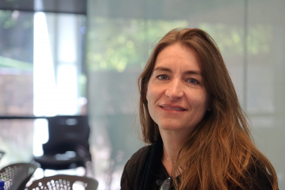
As a University of California, Los Angeles professor and the founder of Murmur — a sustainable architecture firm — Heather Roberge has been on the frontline of some of architecture’s most modern advancements. She is responsible for award-winning concepts like “Succulent House,” which reimagines how a modern building can impact environmentally-conscious behavior by displaying water collection instead of hiding it behind walls.
This fall, the School of Architecture is hosting her as a visiting professor, as she continues her current research on the impact of digital technology on architecture. Last Wednesday night, she demonstrated some of her work in a presentation titled “Form and Visuality.” Arts and Entertainment had the chance to speak with her the next day about her creative perspectives and thoughts and reactions to her experiences at the University.
The following interview has been edited for length and clarity.
Arts and Entertainment: When it comes to your experimental projects like “En Pointe,” you tend to have your work serve as art and expression while also involving the traditional, utilitarian discipline of engineering. How do you relate those two things?
Heather Roberge: Well, I’m quite interested in the design of structures. I started studying as an engineering student when I was an undergrad, but I’m not so interested in engineers’ foregrounding of weight and efficiency … I’m interested in structures that aren’t first and foremost the least means to achieve a job. I’m interested in unusual load paths that give you some other extra side effect … So rather than ‘least material in order to hold the load, we add factors like visual perception, forms like the silhouette of the column, and so you get a response that triangulates the parameters instead of producing a quantitative response.
AE: So it’s efficiency along more than one dimension of just “maximize this,” it’s about the unintended effects as well sometimes?
HR: Yes.
AE: Many argue that digital aids and tools can hinder creativity by making it too easy to design for that one dimension of efficiency, robbing the creator of an artistic voice in that process. How do you counter that?
HR: It appears that when you embrace a digital tool or a kind of mode of manufacturing that you’re deferring to the logics of that particular device, [but] in fact it’s more complex than that. So if you’re trying to communicate with a 3D printer, there’s an intermediary tool between you and the printer, and that is a modeling tool. And that modeling tool has any number of modes of description that exist within it. So you are always free to choose tools within tools within tools that allow you to be creative … The tool is actually quite open-ended, especially 3D printing, because 3D printing has very little self-weight and such fine tolerance you can make almost anything with a 3D printer.
AE: So rather than being a medium that defines your work, technology is just an enabling tool?
HR: Yeah, it’s just a representation of the three-dimensional drawing that you are producing. For that reason, I’m not as interested in 3D printing as much as other forms of creation because there’s not very much resistance or material information that you can fold into the design process.
AE: So rather than this one-size-fits-all approach of 3D printing where you can make a lot but have very limited material choice, you prefer more specialized and material-based approaches?
HR: Yeah … 3D printing is also a rather slow process. It’s quick compared to making a real object but it’s incredibly slow at making numerous repeats of an object. That’s why you don’t often see 3D printing used at an industrial scale. You have kind of bespoke jewelry designers and couteur garment designers using it, but you wouldn’t use it to make thousands of repeated parts.
AE: Right, it’s about smaller, modular elements. With your work, “Succulent House,” you addressed the issue of efficiently collecting water through architectural design. What inspired that process and would you say you’re trying to have your design integrate into and interact with a larger world?
HR: What inspired it was an interest in thinking about the transformation of the house if you were to try to accommodate an issue of sustainability that was integral to the organization of the house rather than being equipment that you add-on to a traditional house. Frequently we’re seeing upgrades to materials or upgrades to equipment that’s clipped on to the house, but the house as a structure and organization isn’t really being reconceived in relation to environmental performance … “Succulent House” is trying to incorporate just one factor of sustainability, which is reducing water use and recharging ground water. So how are you more mindful of how much water you use, where it comes from and where it goes when you’re finished using it? By incorporating rainwater gathering in the heart of the building it’s there to visually reveal the cycles of your use of water as well as the rainwater cycles of your particular location. It makes the building connected to the systems that sustain it, so instead of hiding the plumbing in the wall and the waste pipe underneath the floor, [it] makes you aware of the technology that’s supporting your lifestyle in the house.
AE: Beyond environmental interaction, like optimising architecture for resource efficiency and factors like climate change, you’re also accommodating behavior by having things like rooms that serve multiple purposes. The way people nowadays will treat the kitchen as a social space when that didn’t happen at all 40 years ago.
HR: Right, of course. There used to be strict subdivisions between the work that was done in the house and the social and communal sections of the house. Since our [modern] lifestyle supports fuzzy boundaries between work and leisure in the house, you could imagine … that you could extend that to the question of how many single-use spaces does a house need and can you use clever design to make a fewer number of spaces serve more purposes? To me that serves as a more straightforward response to sustainability than doing remediation where you try to improve the R-value of a wall when you could have far more usable wall if you designed more cleverly.
AE: How have you tried to incorporate these themes in your time as a guest professor here at the University?
HR: Well, I have a wide-ranging number of interests, so what I’m working on with the students now is a particular slice of my interests. Right now they’re designing a public branch library for D.C., but they’re using a close study of the column, of space-making and of producing organization in architecture. So they’re using those things as a lens to construct an environment for a library.
But while doing that we’re beginning to have conversations about the forms of social infrastructure that a library provides to the public as well. Since there are so few kinds of building types that serve the public so immediately, the library is one that we’re seeing as a social space, as a leisure space, and as a space for access to technology for communities that don’t have those resources at home.
AE: Both D.C. and Charlottesville have very neoclassical-inspired architectural design. I imagine it brings about a very different character from your full time work at UCLA. What has that been experience been like, getting to know that different perspective?
HR: It’s been interesting because in a way I’m offering an alternative to neoclassical expression. There’s some students who are incredibly enamored with the Jefferson Mall — and justifiably so — but I think one of the incredible things about architecture is that as technology and culture shift, architectural expression typically shifts with it. So to me, holding on to neoclassicism while the world changes around it seems to be missing opportunities for invention. Rather than think about new things or changing aesthetics as devaluing old traditions, I would say it’s just adding new perspectives on long-standing questions. So that’s why we’re looking at the column — in order to see its progression, its evolution, and variation across time, so that we understand the principles at work and the various ways that those principles get translated into expression.
AE: From this wonderfully eclectic and opinionated set of architecture students at the University, what’s surprised you the most?
HR: I am happy to see their willingness to engage in methods they might not have done before, and it’s really interesting to watch them learn and discover things in their own work just by studying the methods that they’re using. So watching them shift perspective is something that I really enjoy and there’s a lot of talented students. I’ve also had the opportunity to work with young faculty students who are teaching here, and that’s also great because one of the advantages of doing visiting positions is that you learn from this new context about things that may not be foregrounded about where you live and work. So I think it’s really a two-way feedback loop where I’m learning from them, and they’re learning from me.
AE: Lastly on that note, what’s a takeaway from Charlottesville that you think you’ll bring back home to your practice?
HR: I think that the boundary between public and private space is something that’s not fixed, but over the course of the day certain spaces move from public ones to private ones. The front yards of the Pavilion for instance become private in the evening, so there’s these interesting dual purposes served by things that I would have assumed have fixed designations.


