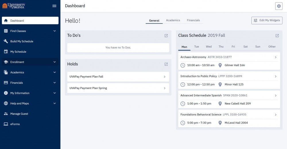
The University recently rolled out a redesign for the Student Information System, often lovingly referred to as SIS. The academic portal — in my experience throughout high school and first year — suffered from challenges across the user experience board. From a visually challenging graphic user interface and slow load times to excessive buttons and checkboxes for simple actions in the enrollment shopping cart, SIS was difficult to use. It was especially unpalatable to us modern students, nowadays rightfully accustomed to usable, friendly designs. As an engineer, I noticed there were problems with the system that I only wished I had the technical knowhow and authority to solve. However, many of my previous complaints have been resolved with the latest functionality and visual update.
The most noticeable change to SIS is its new, sleek user interface. The desktop version has been brought into artistic line with the mobile site’s design, only now with the added functionality of a proper personal computer. The dashboard feels useful, with widgets reminiscent in functionality of Blackboard, as many of my fellow northern Virginians might notice. From my cursory survey of the site, most old functions have been streamlined, if not as much as I would have preferred. There’s even a handy “download schedule” button, so gone are the days of manually inputting classes into my calendar app of choice. There are still boxes to check in the shopping cart, but at least they look a little prettier now. The loading screens are not noticeably faster, but there are fewer of them to go through, thanks to the handy all-access menu on the sidebar of the website. Additionally, access to one of my favorite functions, the planner, is now much more visible.
What I truly appreciate is perhaps the most important change, the “build my schedule” function. After selecting courses for your schedule and putting them in your shopping cart, SIS can now automatically build a plethora of schedules for you, eliminating the need for third party planners such as Coursicle. The filters, preferences and compare functions are usable, if not amazing, and generally get the job done conveniently within the system you’re using. It seems to me that the past’s arbitrary six-digit course codes are really no longer as important as they used to be. With a convenient calendar and list-view of your potential schedules, I predict this will quickly become a student favorite function in our not-so-favored administrative system.
For all the positive changes that you will discover and that I’ve mentioned, there are noticeable issues still present. For instance, some of the less used functions, such as the What-If report, are still prohibitively tedious to use, even still relying on the old interface at points. As I mentioned earlier, the loading times are not much better, if at all. It is also notable that the new SIS is still officially unsupported on Microsoft Edge, the preferred browser of many students on Grounds. We are still dealing with SIS, after all, albeit with a fresh coat of paint and some nifty new levers to pull. The system is not perfect, and likely never will be. Still, the redesign makes SIS significantly more friendly to use.
Hopefully, the practice of adding functionality to the University’s online tools continues beyond SIS. UVACollab lacks much of the integrated tools that would make students’ — and professors’ — lives easier. Collab still lacks an automated all-class assignments calendar, has no standard for course site layouts and — most egregiously — has no search bar. Web portals are powerful tools, but they need to be carefully designed to avoid frustrating users, and there’s certainly room for improvement on that front with Collab. For another quality of life change to Collab, system admins might want to issue guidance on how to pronounce the website name. Clearly, all of the University’s online academic resources still need some work.
As with all new systems, let’s remain cautious of these changes. However, based on my personal testing and unshaken belief that little could be worse than the previous system, I think we can give some cautious kudos to the folks who redesigned SIS. Hopefully, it lives up to expectations and receives further quality of life updates as time goes on — and doesn’t crash during enrollment season.
Bilge Batsukh is an Opinion Columnist for The Cavalier Daily. He can be reached at opinion@cavalierdaily.com.


